
So, what is cohort analysis?
Think of it like looking at school yearbooks. Instead of lumping every student who ever attended into one giant group, you look at them by their graduating class—the Class of '21, the Class of '22, and so on. In business, you do the same with your users, grouping them by the month they signed up. This lets you track each "class" over time, revealing a much clearer story of how people actually use your product.
In short, it helps you understand if your business is genuinely getting better or just getting bigger.
Beyond Vanity Metrics: Why Cohort Analysis Matters
Imagine your business is a bucket you're trying to fill with water (your users). A vanity metric, like your total user count, is just looking at the water level. It might be rising, which feels great! But what if you have a dozen leaks springing up at the bottom? You’re losing old users as fast as you’re gaining new ones, but you can’t see the leaks from the top.
Cohort analysis is the tool that lets you find and plug those leaks.
It helps you shift from asking, "How many total users do we have?" to the much more valuable question: "Are the users we got in April sticking around longer than the ones from January?" For any founder, that shift in thinking is a game-changer.
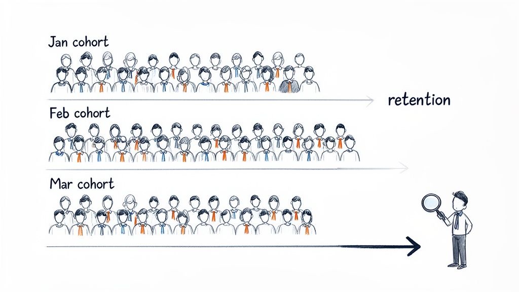
This simple visual shows how you separate users into groups (Jan, Feb, Mar) to analyze their behavior over time, like tracking how many from each group remain active after one month, two months, and so on.
Vanity Metrics vs. Cohort Insights
| Metric Type | What It Tells You | What It Hides |
|---|---|---|
| Vanity Metric | A simple, top-level number (e.g., "10,000 total users"). | The underlying trends, like if users are churning, if new features are working, or if your user base is healthy. |
| Cohort Insight | A detailed story (e.g., "Our March cohort has a 20% higher 3-month retention than our January cohort."). | It’s all about the details, so nothing is hidden. You get a direct view into user behavior and product performance over time. |
Simply put, cohort analysis gives you the context that top-line numbers completely miss.
Uncovering the Real Story in Your Data
By grouping users, you can finally isolate the impact of your actions and figure out what really works. This method isn't new; it has deep roots in social science. Demographers first used cohort analysis back in the early 20th century to study birth rates and mortality across different generations. By the 1960s, it was a standard tool for understanding societal trends, long before SaaS was even a concept. You can read more about its history and its broad applications.
That same core idea now gives founders incredible clarity. Instead of a spreadsheet full of abstract data, you get real stories about your users.
For instance, you might discover that:
- A new onboarding flow you launched in March led to a 15% higher retention rate for that month's cohort compared to February's.
- Users acquired from a specific ad campaign have a much higher lifetime value (LTV), proving your ad spend is actually bringing in loyal customers.
- A confusing feature released in May caused a spike in churn for that week's cohort, flagging an urgent need for a UX fix.
Cohort analysis forces you to look at your business through the eyes of your users' lifecycle. It’s not just about acquiring customers; it’s about understanding if you're delivering enough value to make them stay.
Ultimately, this type of analysis gives you the hard proof needed to make smarter decisions. It tells you if your product is improving, if your marketing is attracting the right people, and if you’re building a company that can actually last.
Two Powerful Ways to Group Your Users
When you're trying to figure out what makes users stick around, not all groupings are created equal. The trick is to choose the right way to slice up your user base to get real, actionable answers. Think of it this way: you can group people by when they showed up, or by what they did once they got there.
Each approach tells a completely different story about user behavior. Getting a handle on both is how you pinpoint what actually drives retention and growth.
Acquisition Cohorts: Grouping by Sign-Up Date
First up is the most common method: the acquisition cohort. This is pretty straightforward—you simply group users based on when they signed up for your product. You might create a cohort for everyone who joined in January, another for February, and so on. It’s like creating a "Class of January" versus a "Class of February."
This approach is perfect for seeing how time-based events affect long-term user loyalty.
- Marketing Campaigns: Did that big ad campaign in March bring in more valuable users than your usual efforts in February?
- Product Launches: How does the retention of users who signed up after you launched that killer new feature compare to those who joined before?
- Onboarding Changes: You revamped your onboarding flow in May. Did that group stick around longer than the April crew?
Acquisition cohorts give you a clear baseline for tracking how "sticky" your product is over time. It’s a fantastic starting point, but to really understand why some users stay and others don't, you need to dig a little deeper into their actions.
An acquisition cohort tells you if your retention is improving. A behavioral cohort tells you why. Both are critical for building a product that users love and continue to pay for.
Behavioral Cohorts: Grouping by What Users Do
While acquisition cohorts focus on when people joined, behavioral cohorts group them by what actions they took within a certain window of time. This is where you move from just observing trends to truly understanding the "aha!" moments that lock users in.
Instead of just looking at sign-up dates, you group users based on meaningful actions they've taken.
For instance, you could group users who:
- Used a specific feature, like integrating your API.
- Finished the entire onboarding tutorial.
- Made their first purchase within 24 hours of signing up.
Imagine you run an e-commerce platform. You could create two cohorts: users who used the "one-click checkout" feature in their first week, and users who didn't. If you discover the "one-click checkout" group has a 30% higher retention rate after three months, you've just struck gold. You’ve found a powerful predictor of long-term value. This kind of insight helps you sharpen your focus and attract more users who are likely to perform these high-value actions. To learn more about identifying these key user groups, check out our guide on audience analysis for SaaS growth. This is how you prove which features really matter.
The Three Metrics Cohort Analysis Unlocks
So, what do you actually get out of cohort analysis? It’s not just an academic exercise. This is where you translate user behavior into hard numbers that tell you if your business is really working.
For any SaaS company, it boils down to three game-changing metrics that move you from guessing about user satisfaction to knowing exactly how valuable your product is over time.
User Retention Rate
First up is user retention rate. In simple terms, this tells you what percentage of people from a specific group are still using your product after a certain amount of time—a week, a month, a year, you name it. It's the ultimate test of your product's "stickiness."
Instead of looking at one single, often misleading, retention number for everyone, you get a much clearer picture.
Example: Your January sign-ups had a Month 1 retention of 40%. But after you rolled out a new onboarding flow, the March cohort came in with a Month 1 retention of 55%. Boom. That’s concrete proof your changes are making a difference.
Cohort analysis turns retention from a vague goal into a specific, measurable outcome of your product decisions. It shows you if you're building something people genuinely want to keep using.
Churn Rate
The flip side of retention is churn rate. This is the percentage of users from a cohort who stop using your product in a given period. It's your early warning system, pinpointing exactly when and where customers are slipping away.
A single, top-level number might tell you that 10% of your users churned last month. Okay, but why?
Example: Cohort analysis could reveal that most of that churn came from a small group of users who signed up during a week when you had a critical server outage. Now you’ve gone from a confusing problem to a specific, actionable insight.
Customer Lifetime Value
Finally, we get to the big one: customer lifetime value (LTV). This is the total revenue you can reasonably expect to get from a single customer throughout their entire time with you. Looking at LTV through the lens of cohorts is where things get really powerful.
When you calculate LTV for each cohort, you can start to see if the quality of your customers is getting better.
Example: You might find that users acquired from a new LinkedIn ad campaign in April have an LTV that's 20% higher than older cohorts from Twitter ads. That’s the kind of hard data that gives you the confidence to double down on your most profitable acquisition channels.
In SaaS, tracking these three metrics by acquisition month or channel is non-negotiable. The meditation app Calm famously tripled its retention by using behavioral cohorts to identify which actions predicted long-term use—a perfect example of these metrics in action. You can discover more insights about cohort analysis applications and see how they drive real results.
How to Build Your First Cohort Report
Alright, let's move from theory to action and build your very first cohort report. You don't need a pricey, complex analytics platform to get started. Honestly, one of the most powerful tools you have is a simple spreadsheet. We're going to walk through how to take a basic list of user signups and turn it into a clear, actionable retention table.
The whole process boils down to a few key steps: grabbing your raw data, organizing it in a way that makes sense, and then using some simple formulas to see how your retention stacks up over time. The goal here is to strip away the complexity and show you how to find powerful insights today.
This flow chart gives a great visual of how tracking core metrics like retention and churn ultimately feeds into your understanding of lifetime value.
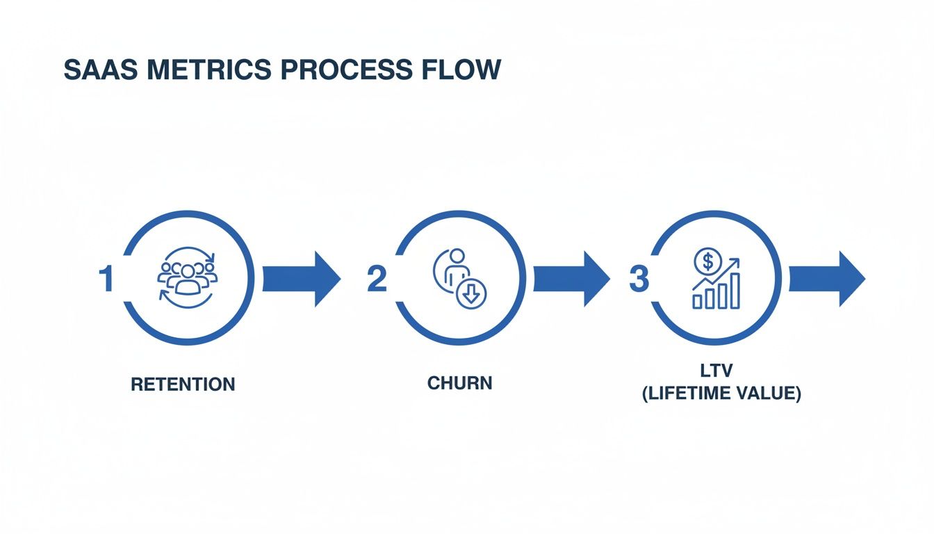
As you can see, there's a clear path from keeping users around to figuring out what they're worth in the long run. That's really the heart of cohort analysis.
Creating a Retention Table in a Spreadsheet
Let's start with the spreadsheet method. All you need is a list of your users with two crucial data points for each person: when they signed up and when they were last active.
Step 1: Export Your User Data. First, grab a CSV file from your database. Make sure it includes a unique user ID, their registration date, and their "last seen" or last activity date.
Step 2: Calculate User Age. In a new column, you'll figure out how many months passed between a user's sign-up date and their last activity. This simple calculation tells you how long each user stuck around.
Step 3: Create a Pivot Table. This is where the magic happens. Use your spreadsheet's pivot table function. You'll want to set the rows to be the user's sign-up month and the columns to be their "user age" (in months). For the values, just do a count of the unique user IDs.
This simple setup groups your users into monthly acquisition cohorts (the rows) and then shows you how many of them were still active in each following month (the columns). With a little conditional formatting, you can instantly spot your best-performing cohorts and see exactly where engagement starts to drop off.
Using SQL for Direct Data Pulls
If you're comfortable working directly with your database, you can bypass the manual export/import dance entirely with a SQL query. This approach is not only faster but also way more scalable. Plus, you can automate it for regular reporting.
A basic query to get this data might look something like this:
SELECT
  DATE_TRUNC('month', registration_date) AS cohort_month,
  EXTRACT(MONTH FROM AGE(last_seen_date, registration_date)) AS months_active,
  COUNT(DISTINCT user_id)
FROM
  users
GROUP BY
  1, 2
ORDER BY
  1, 2;
Key Takeaway: It doesn't matter if you're using a spreadsheet or SQL. The core logic is identical. You group users by when they joined, and then you track their activity over time. This foundational consistency is what makes cohort analysis so incredibly reliable.
While these manual methods are perfect for getting your hands dirty and really understanding the data, dedicated platforms can offer much deeper insights as you grow. If you're getting to that point, our guide on choosing the best SaaS business intelligence tools can point you in the right direction. The most important thing is to just get started with the tools you have right now.
Reading the Signals to Find Winning Ideas
Most people think of cohort analysis as an internal report card for their product. But what if you could use it to discover and de-risk new business ideas before you even start building?
By turning your focus from your own users to the broader market, you can spot powerful signals of success before writing a single line of code. This is the very heart of market validation.
Think of it like this: you notice a competitor has been pumping serious money into the same set of ads for months. That’s not just a big marketing budget you're seeing. It’s evidence of a "survivor cohort"—the hallmark of a profitable business. They simply wouldn't keep paying for traffic if those users weren't sticking around and generating more revenue than they cost to acquire.
That sustained ad spend is a fantastic proxy for high retention and a healthy customer lifetime value. It’s a bright, flashing sign that they've found a real problem to solve and, crucially, that people are willing to pay for their solution.
Validating Your Own MVP with Cohorts
Once those external signals point you in the right direction, you can flip the script and apply cohort analysis to your own Minimum Viable Product (MVP). Here, the goal is simple: confirm that you’re actually building something people want to stick with.
From day one, retention becomes your north star metric, guiding every decision on your journey to product-market fit.
This mindset is a game-changer, especially in crowded markets with high ad costs. For an early-stage SaaS founder running on a tight budget, looking at your business through a cohort lens can be the difference between burning cash on losing channels and doubling down on the 10–20% of cohorts that actually drive long-term revenue.
By applying the principles of cohort analysis to the market, you can find proven demand. By applying it to your MVP, you can prove you’re the right solution.
This two-step framework—observe, then validate—takes so much of the guesswork out of building a business. You start by finding where the money is already flowing and then use your own retention data to prove you’re on the right path. It’s a smarter way to build, perfectly aligned with the core ideas of market validation and launching a successful product.
Common Mistakes That Invalidate Your Data
A flawed cohort analysis can be worse than no analysis at all. It gives you the confidence to make decisions that are completely wrong. While it's a powerful method, a few common traps can easily trip you up, invalidating your data and sending you chasing ghosts. Knowing what these pitfalls are is the first step toward getting insights you can actually trust.
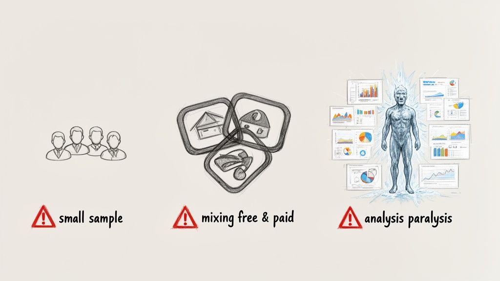
If you can steer clear of these mistakes, your conclusions will be built on a solid foundation, not just noise.
Ignoring Small Cohort Sizes
One of the most common mistakes is drawing massive conclusions from tiny groups of users. Let's say your January cohort only has 15 users. If two of them churn, that's a 13% churn rate. That number is statistically meaningless and will swing wildly from month to month, causing either false panic or premature celebration.
You simply need a big enough sample for the patterns to be reliable. Otherwise, you're not analyzing a trend; you're just watching random chance unfold.
As a rule of thumb, make sure your cohorts are large enough that one or two users can't dramatically skew the group's metrics. Aim for cohorts with at least 100 users to get a stable, meaningful analysis.
Mixing Different User Segments
Another huge mistake is lumping completely different types of users into the same cohort. For instance, analyzing your free trial signups right alongside your high-touch enterprise customers will give you a messy, useless retention curve. These two groups have totally different motivations, behaviors, and expectations.
To get a clear picture, you have to break them apart.
- Free vs. Paid: Analyze their retention and conversion rates separately. They behave very differently.
- Acquisition Channel: Users from organic search are not the same as users from a paid ad campaign. Compare them.
- User Plan: How do your "Basic" plan users stick around compared to your "Pro" plan users?
Falling into Analysis Paralysis
Finally, it's incredibly easy to get lost in the data and try to perfect your report. You can spend weeks tweaking charts, adding more segments, and chasing the perfect visualization, all while the window to make a decision closes.
Cohort analysis is supposed to be a tool for quick, data-informed action, not a month-long research project. It’s far better to make a decision based on a "good enough" analysis today than a perfect one next quarter. The goal here is momentum, not perfection.
Your Questions, Answered
You've got the basics down, but let's tackle a few common questions that pop up when you start putting cohort analysis into practice.
How Often Should I Run My Cohort Analysis?
For most SaaS startups, running a cohort analysis monthly hits the sweet spot. It lines up perfectly with how you track MRR and gives you enough time to see if last month’s marketing push or feature launch actually made a difference.
If your team works in faster cycles, like weekly sprints, then a weekly check-in can give you much quicker feedback on what's working and what isn't.
What’s a Good Retention Rate to Aim For?
This is the million-dollar question, and the honest answer is: it depends. A good retention rate varies wildly depending on your industry, price point, and who you're selling to.
That said, for many B2B SaaS companies, if you're keeping 35% or more of your users around after three months, you're likely on to something big. That’s a solid sign of product-market fit.
Instead of chasing a magic number, focus on your own trends. You're looking for two key signals:
- Each new cohort you acquire should stick around longer than the last one.
- The retention curve for each cohort eventually flattens out, proving you have a core group of loyal, long-term customers.
Can I Do Cohort Analysis Without Fancy Tools?
Absolutely. You don't need an expensive analytics suite to get started. A simple spreadsheet is more than powerful enough.
All you need is a data export with three key columns: a user ID, their sign-up date, and the date they were last active. From there, you can use a pivot table to group users by their sign-up month and track their activity over time. It’s a low-cost, high-impact way to build a classic retention chart and get the answers you need.
Ready to stop guessing and start building on proven demand? Proven SaaS analyzes real-world ad spend to show you which SaaS ideas are already profitable, letting you validate your next venture with hard data. Find your next profitable SaaS idea today.
Build SaaS That's
Already Proven.
14,500+ SaaS with real revenue, ads & tech stacks.
Skip the guesswork. Build what works.
Trusted by 1,800+ founders