If you're looking for the perfect Instagram ad size, start with 1080 x 1080 pixels for square Feed ads and 1080 x 1920 pixels for vertical Stories and Reels. Sticking to these two core dimensions ensures your visuals look sharp and professional, giving your ad the best possible first impression without any awkward cropping.
Your Quick Reference Guide To Instagram Ad Dimensions
Nailing your Instagram ad size is the first—and arguably most important—step in building a campaign that works. When your creative is built for a specific placement, it looks professional, feels native to the platform, and prevents frustrating issues like pixelation or cut-off text.
This guide gives you the exact specs you need, right now. No fluff, just the facts.
The visual below breaks down the key dimensions for Instagram's most valuable ad placements.
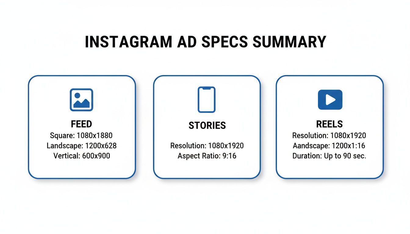
As you can see, every placement has its own rules, from the classic square Feed ad to the full-screen, immersive formats in Stories and Reels. One size definitely does not fit all.
Instagram Ad Specs Quick Lookup Table
To make your life easier, here are the essential numbers for the most common ad formats. Keep this handy to prep your images and videos before you open Meta Ads Manager. Getting this right from the start saves a ton of time.
| Ad Placement | Recommended Dimensions (Pixels) | Supported Aspect Ratio | Common File Types |
|---|---|---|---|
| Instagram Feed | 1080 x 1080 (Square) | 1:1 | JPG, PNG, MP4 |
| Instagram Stories | 1080 x 1920 (Vertical) | 9:16 | JPG, PNG, MP4 |
| Instagram Reels | 1080 x 1920 (Vertical) | 9:16 | MP4, MOV |
This table covers the fundamentals for getting your creative live and looking good.
One of the most common mistakes is designing a single creative and forcing it to work everywhere. Example: a clothing brand uses a beautiful landscape photo (16:9) of a model on a beach for their Feed ad. When they try to run the same ad in Stories, Instagram automatically crops the image to fit the vertical 9:16 space, cutting out the model entirely. Tailoring your creative to each placement isn't just a "best practice"—it's critical for a good return on ad spend.
Of course, getting the sizes right is only half the battle. If you want to see what top-performing brands are doing, check out a comprehensive ad library for inspiration. It's a great way to see how others apply these technical specs to build campaigns that actually convert.
Why Getting Instagram Ad Specs Right Is a Big Deal
Nailing your Instagram ad size isn't just about ticking a technical box; it's fundamental to a successful campaign. When your creative doesn't fit the placement, it looks sloppy and amateurish, which is an instant turn-off for users.
This leads to preventable problems like blurry images, text getting cut off, or ads being rejected by Meta. Each issue costs you time, money, and momentum.
The Real Impact on Performance and ROI
For anyone managing a budget, the line between the right ad dimensions and a healthy return on investment (ROI) is crystal clear. An ad that's formatted correctly for its placement feels native to the feed. It blends in, grabs attention for the right reasons, and builds trust with the viewer.
This smooth user experience pays off in tangible metrics:
- Higher Engagement: Ads that look like they belong are more inviting to like, comment on, and share.
- Better Click-Through Rates (CTR): When your call-to-action is clear and easy to see, more people will click it.
- Increased Conversions: A seamless journey from a great-looking ad to your landing page is crucial for getting people to take action.
Think of it this way: getting the Instagram ad size right is a strategic advantage. It means every dollar you spend is showing off your creative in the best possible light, maximizing its chance to work.
Staying Afloat in a Crowded Feed
Let's be real—the competition on Instagram is fierce. The platform pulled in $66.9 billion in revenue, serving ads to over 1.74 billion users around the globe. And with Reels set to account for 38.5% of all Instagram ad placements by 2025, you have to get your vertical video game on point to stay competitive.
When you treat ad specs as a core part of your strategy, you're not just following rules. You're making your ad spend more efficient. A pixel-perfect ad is a step toward better performance, every time.
Understanding where your creative fits in this massive ecosystem is key. By using the right specs, you ensure your message comes across loud and clear, helping you stand out and connect with the people you’re trying to reach. For a deeper dive, you can see how audience intelligence tools help identify high-value segments.
Instagram Feed Ad Specs and Best Practices
The Instagram Feed is still one of the best spots to run ads. Unlike the fast pace of Stories or Reels, Feed ads sit right in a user's main content stream, giving you a chance to hold their attention—but only if your creative meets the technical specs.
When creating a Feed ad, you have three main aspect ratios to choose from. Picking the right instagram ads size depends on the story you're telling. Let's look at the numbers for each format.
The Three Core Ratios for Feed Ads
The secret to a great Feed ad is choosing an aspect ratio that takes up as much screen space as possible. Each option is suited for different types of content.
Square (1:1): This is the classic Instagram look. A 1080 x 1080 pixel canvas is clean, balanced, and great for clear product shots or graphic-based ads.
- Example: A software company uses a 1:1 square ad with a clean graphic to highlight a single feature.
Portrait (4:5): This is the format most pros recommend. At 1080 x 1350 pixels, this taller orientation fills up more of the screen, making it harder to scroll past. It's perfect for showing off detailed visuals or full-length fashion shots.
- Example: An online clothing store uses a 4:5 portrait ad to show a model wearing a complete outfit, grabbing a user’s attention mid-scroll.
Landscape (1.91:1): While this takes up the least vertical space, it’s the go-to for anything with a wide, cinematic feel. Use 1080 x 566 pixels for panoramic photos or videos that wouldn't work in a vertical frame.
- Example: A travel agency uses a 1.91:1 landscape video to show a sweeping shot of a mountain range.
File Requirements and Technical Specs for Feed Ads
Getting the dimensions right is only half the battle. Your files must also meet technical rules to ensure they upload correctly and look sharp.
You can't skip the technical details. Instagram compresses everything you upload, so starting with a high-quality, optimized file is the best way to ensure it still looks great after their system processes it.
Here are the hard numbers you need to know:
- File Types: For images, stick with JPG or PNG. For video, MP4 is your best bet.
- Maximum File Size: Images can't be larger than 30MB, and videos top out at 4GB.
- Video Duration: Feed video ads can run from 1 second up to 60 minutes. However, shorter, engaging videos almost always perform better.
- Text and Hashtags: Keep your primary caption to about 125 characters so it doesn't get cut off. You can include up to 30 hashtags, but a few highly relevant ones are better than a maxed-out count.
Mastering Vertical Ads for Instagram Stories and Reels
Instagram Stories and Reels are where the action is. These high-engagement placements demand a mobile-first mindset. To win here, you need to think full-screen, vertical, and immersive.
The absolute must-have for both Stories and Reels is a 9:16 aspect ratio. For the best quality, build your creative at 1080 x 1920 pixels. This ensures your ad fills the entire screen perfectly, without ugly black bars or cropping that screams "I'm an ad!"
Getting the right instagram ads size is your ticket to capturing attention in these fast-scrolling formats. The audience is massive: these placements reach over 900 million users every month, with Reels now making up 22.2% of all ad placements. If you want a piece of that action, designing your assets at the correct 1080x1920 dimension is non-negotiable. You can find more great tips on optimizing ad formats on sproutsocial.com.
Understanding the Safe Zones
So, you’ve got the dimensions down. But here’s where many marketers stumble: you have to design around the Instagram interface. The app overlays your profile icon, call-to-action (CTA) button, and engagement icons right on top of your ad. If your key message is hiding under one of those, it might as well not be there.
This is why we have "safe zones"—the areas in the middle of the screen where your text, logos, and important visuals are guaranteed to be seen.
Think of the safe zone as the main stage. Everything else is in the wings, easy for the audience to miss. A smart design always keeps the star of the show—your core message—right in the spotlight.
To keep your ads looking professional, stick to these guidelines:
- Top Safe Zone: Leave about 15% of the screen’s height (around 250 pixels) clear at the top. This space is for your profile info.
- Bottom Safe Zone: Keep the bottom 20-25% of the screen (roughly 340-400 pixels) clear. This is where Instagram places the CTA button and caption.
By keeping essential elements within this central sweet spot, you ensure every viewer sees exactly what you want them to see.
Technical File Requirements for Stories and Reels
Once your creative is designed with safe zones in mind, the final step is ensuring the file itself is ready. Instagram has a few technical rules to ensure your ads load quickly and look great.
Key Technical Specs:
- File Types: For video, stick to MP4 or MOV. For static images, JPG or PNG are your best bets.
- Maximum File Size: Keep videos under 4GB and images under 30MB.
- Video Duration: Stories ads can be from 1 second to 60 seconds long. Reels ads can run up to 15 minutes, but shorter, punchier videos almost always perform better.
Example: A software company runs a 15-second Reel ad showing a new feature. They wisely place the text explaining the benefit right in the middle of the screen—far from the profile icon at the top and the "Learn More" button at the bottom. This simple check makes the ad feel professional and effective.
Carousel and Collection Ad Specs
Sometimes, a single image or video isn't enough. Carousel and Collection ads let you build more interactive experiences to showcase multiple products or tell a detailed story. Getting the Instagram ads size right for these is crucial for creating a smooth journey for your audience.
Carousel ads are the workhorses of visual storytelling. They let you string together 2 to 10 "cards," and each card can have its own image, video, headline, and link. This format is perfect for a how-to guide, highlighting product features, or showing off items from a new collection.
Sizing Your Instagram Carousel Ads
If you remember one thing about Carousel ads, make it this: consistency is key. Every card in your carousel, whether image or video, must have the same aspect ratio. If you mix and match, Instagram will automatically crop your creative to fit the dimensions of the very first card, which looks sloppy.
You have two main size options for Carousels in the Feed:
Square (1:1): The classic 1080 x 1080 pixels format is a safe bet. It offers a clean, balanced look perfect for showcasing products.
- Example: A home decor brand displays different items from a new line, with each 1:1 card featuring a single product.
Portrait (4:5): Often the smarter choice. At 1080 x 1350 pixels, this taller format takes up more screen real estate.
- Example: A fashion brand uses 4:5 cards to show a full outfit, creating an immersive, swipeable lookbook.
Whichever size you choose, remember the technical limits. Images (JPG or PNG) must be under 30MB. Videos (MP4) can be up to 4GB and run for up to 2 minutes per card.
Understanding Collection Ads
Collection ads are like a mini-storefront right inside Instagram. They are a powerful e-commerce format that pairs a primary "hero" creative (an image or video) with a product catalog. When someone taps your ad, it opens a full-screen, shoppable "Instant Experience."
Your main hero creative follows standard Feed ad specs, so you can use a square (1:1) or portrait (4:5) image or video.
The real magic of a Collection ad is how it seamlessly bridges discovery and shopping. A user sees a cool video, taps it, and is instantly looking at a browsable catalog without ever leaving the app.
Example: A beauty brand runs a video tutorial as its main ad. A viewer taps it and immediately sees a shoppable collection of every product used in the video. This removes friction from the buying process and can significantly boost conversion rates.
Common Ad Sizing Mistakes and How to Fix Them
Knowing the right Instagram ads size is the first step, but even experienced marketers make simple mistakes that hurt campaign performance. These slip-ups result in blurry images, awkward crops, or key messages getting cut off. The good news? They are easy to prevent.
A little extra effort before you launch can save a lot of wasted ad spend. Let's walk through the most common pitfalls and how to avoid them.
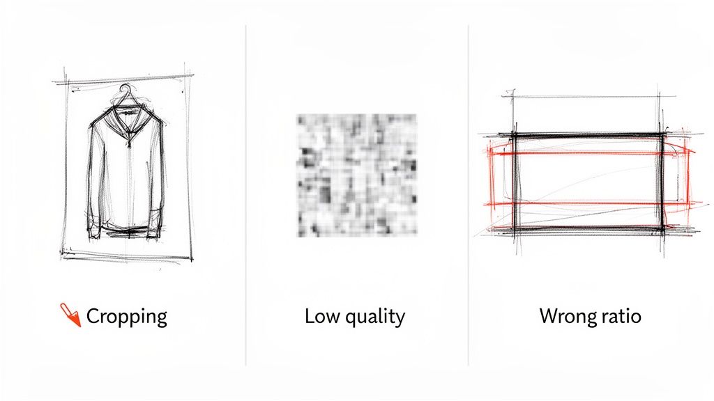
Mistake 1: Ignoring Placement-Specific Aspect Ratios
The most common error is creating one ad and trying to use it everywhere. A 1:1 square ad built for the Feed will look awful in a 9:16 Stories placement. You'll get distracting black bars or an aggressive crop that ruins your visual. It immediately signals "lazy ad."
- The Fix: Design unique creative for each placement. If you're running ads in the Feed (4:5) and Stories (9:16), make two different versions. This is non-negotiable if you want your ad to fill the screen and feel native.
Mistake 2: Forgetting About the Safe Zones
Another classic mistake is putting text or logos too close to the edges of a Story or Reel ad. Instagram overlays its own interface—your profile icon, the "Sponsored" tag, and the CTA button—on top. If your message is covered, it’s useless.
- The Fix: Always design within the "safe zones." A good rule of thumb is to leave about 15% of the space at the top and 20% at the bottom of your 9:16 creative clear. Use the ad preview tool in Meta Ads Manager to check how your ad will look with all UI elements.
Mistake 3: Uploading Low-Quality or Poorly Compressed Files
Ever upload a crystal-clear image only to see it turn into a blurry mess? That's Instagram's compression at work. If your starting file is already heavily compressed or too small, the algorithm will crush the quality even further.
Think of it like making a photocopy of a photocopy—each copy gets worse. You have to start with the best original to get a decent final result.
The Fix:
- Start with the Right Dimensions: Build your creative at the recommended pixel dimensions, like 1080x1920 for Stories. Don't scale up a smaller image.
- Export Correctly: For images, save them as high-quality PNGs or JPEGs. For video, stick to the H.264 codec inside an MP4 or MOV file.
- Check File Size: Keep images under 30MB and videos under 4GB. This helps you avoid Instagram's most aggressive compression.
Your Instagram Ad Creative Checklist
Getting your Instagram ad dimensions right is a great start, but it's only half the battle. Before you hit "publish," run a final quality check on the entire creative package—the visual, the copy, and the call-to-action (CTA). This last look ensures every piece works together.
Think of it as your pre-flight inspection. An ad that's technically sound and creatively compelling is how you maximize your ad spend.
Core Creative Components
Let's quickly run through the three pillars of your ad creative. Each one has a specific job in stopping the scroll and getting the click.
Compelling Headline: Your headline is your hook. Keep it short, punchy, and focused on a key benefit. A question or a bold value statement works well.
Concise Primary Text: Keep your main ad copy to about 125 characters. This avoids the "see more" link, making sure your most important info is visible immediately.
Action-Oriented CTA: Your call-to-action button needs to be crystal clear. If you want sign-ups, the button should say "Sign Up." Selling something? Use "Shop Now." Confusion here will kill your conversion rates.
A great ad is more than a pretty picture with the right dimensions. It's a cohesive message where the visual, text, and CTA all point in the same direction, making it effortless for someone to understand what you're offering and what to do next.
Final Technical and Visual Review
With your copy and CTA locked in, give your visuals one last look. A small mistake here can undermine all your hard work.
- Check Safe Zones: This is crucial for Stories and Reels. Double-check that no important text or logos are hidden by Instagram’s interface. Your message must be 100% visible.
- Visual Clarity: Is your image or video sharp and high-quality? Blurry creative looks unprofessional and can damage brand trust.
- Brand Consistency: Does the ad's style—colors, fonts, and vibe—match your brand's? Consistency is key to building recognition.
Before launching an ad, it's a great habit to run through a quick checklist. This ensures you've covered all your bases.
Ad Creative Pre-Launch Checklist
| Check Item | Best Practice | Status (Checkbox) |
|---|---|---|
| Correct Ad Specs | Dimensions, ratio, and file type match the placement. | ☐ |
| Safe Zones Clear | No key elements are blocked by the UI (Stories/Reels). | ☐ |
| Visual Quality | Image/video is high-resolution and not blurry. | ☐ |
| Headline Hook | Short, punchy, and benefit-driven. | ☐ |
| Primary Text Length | Kept under the 125-character "see more" limit. | ☐ |
| Clear CTA | Button text directly matches the campaign goal. | ☐ |
| Brand Consistency | Visuals align with your brand's established style. | ☐ |
| Proofread Copy | No spelling or grammar mistakes in the text. | ☐ |
Taking a few minutes to tick these boxes can make a huge difference. For an even more detailed breakdown, you can use specialized tools that provide a comprehensive ad creative analysis to find more ways to improve.
Your Instagram Ad Size Questions, Answered
Even with all the specs laid out, a few questions always pop up when you're trying to get a campaign live. Let’s tackle the most common ones so you can launch your ads without a hitch.
What’s the single best size for an Instagram ad?
There isn’t one. The "best" ad size depends entirely on where your ad will show up. A one-size-fits-all approach doesn't work on Instagram.
For the main Feed, I recommend a 4:5 aspect ratio (1080x1350 pixels). It fills more of the screen as people scroll. But for Stories and Reels, you must use the full-screen vertical 9:16 ratio (1080x1920 pixels). Anything else looks unprofessional.
The bottom line: create unique assets for each placement you are targeting.
How do I stop my ads from looking blurry?
The dreaded pixelation is usually caused by Instagram's compression. The trick is to give it a file that’s so well-prepared, it doesn't need to be compressed as aggressively.
Here’s a simple pre-flight check:
- Start with a high-quality source. Create your design at the exact recommended size, like 1080 pixels wide. Never stretch a smaller image to fit a larger space.
- Export it right. For images, save as high-quality PNGs or JPEGs. For videos, the gold standard is the H.264 codec in an MP4 or MOV file.
- Upload the optimized file. When you give Instagram a file in its preferred format and size, you sidestep the harshest compression, and your visuals stay crisp.
What happens if I upload the wrong size anyway?
If you upload a creative with the wrong aspect ratio, Instagram will try to "fix" it by automatically cropping it. This is almost always a bad thing.
This auto-crop can chop off your headline, slice your logo in half, or remove the most important part of your image. Your ad will look broken and unprofessional. Example: a widescreen video forced into a vertical Story will either get awkward black bars or have its sides completely cut off. To ensure your ad looks exactly how you designed it, build it to the right specs from the start.
Ready to stop guessing and start building? With Proven SaaS, you can discover profitable SaaS ideas by analyzing ads that are already working. Our AI-powered platform tracks ad spend, models revenue, and surfaces validated market opportunities, giving you a data-backed advantage. Find your next profitable idea on proven-saas.com.
Build SaaS That's
Already Proven.
14,500+ SaaS with real revenue, ads & tech stacks.
Skip the guesswork. Build what works.
Trusted by 1,800+ founders